and i also go by alex.
currently working at university of washington.
“it looks good, it works good, it does good”


in-depth walkthroughs available upon request.
2020
2020
2018
2020
2019
my manager and i supported 23+ websites for the department of medicine, all on an antiquated drupal 7 web framework – a framework slated to reach its end-of-life.
design an entirely new and original web framework to meet the needs of all users and stakeholders. the end result needs to:
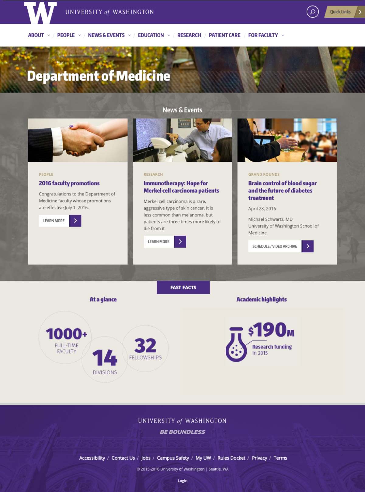
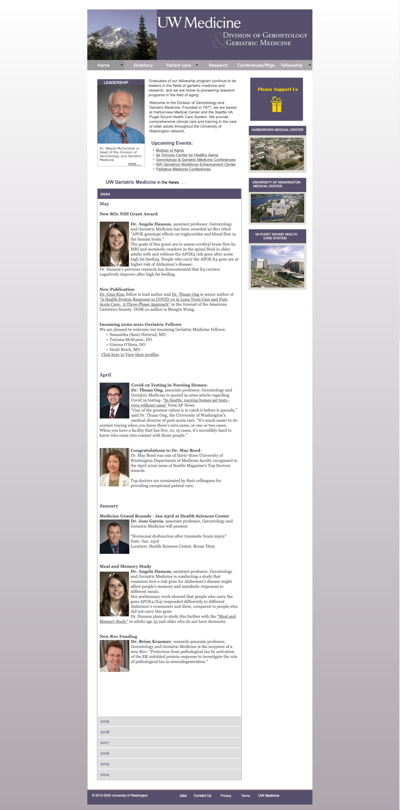
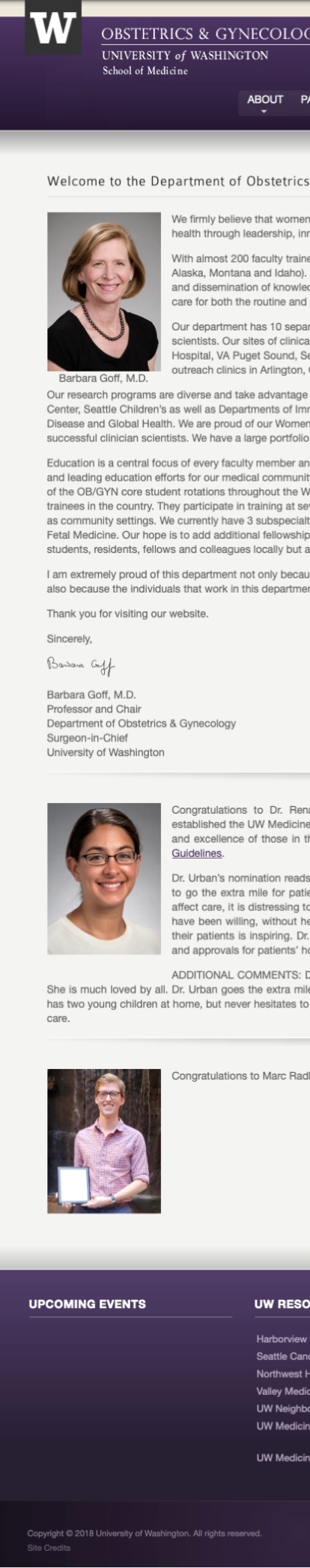
the original templates had remained unchanged for years. some of the main ui/visual problems were:
additionally, there were ux/functionality problems:
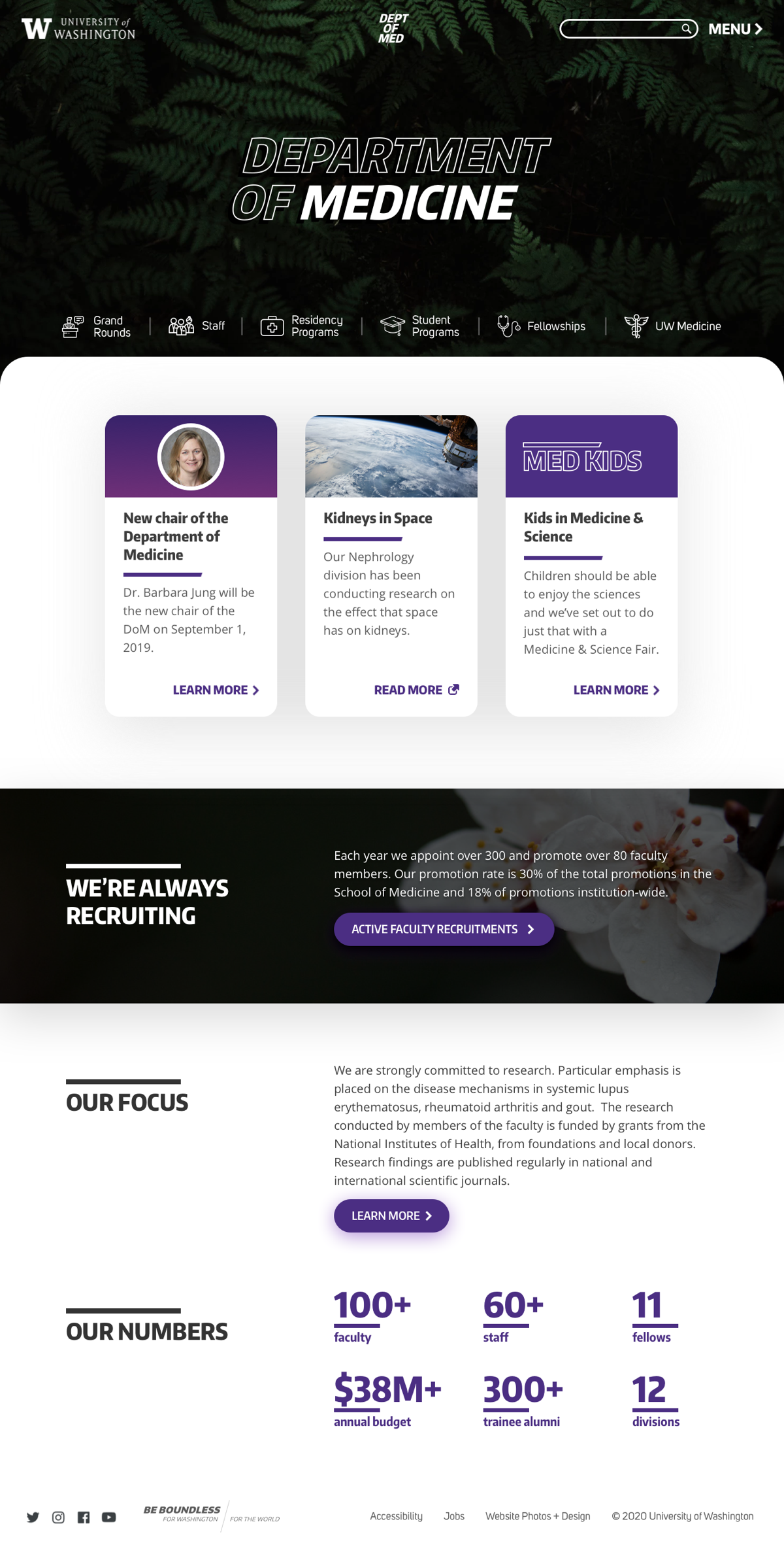
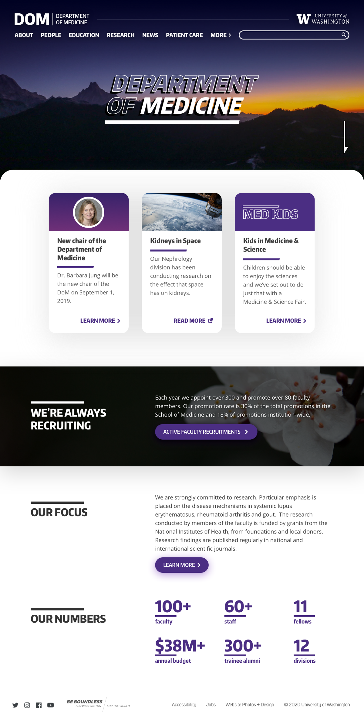
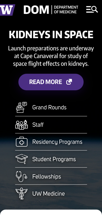
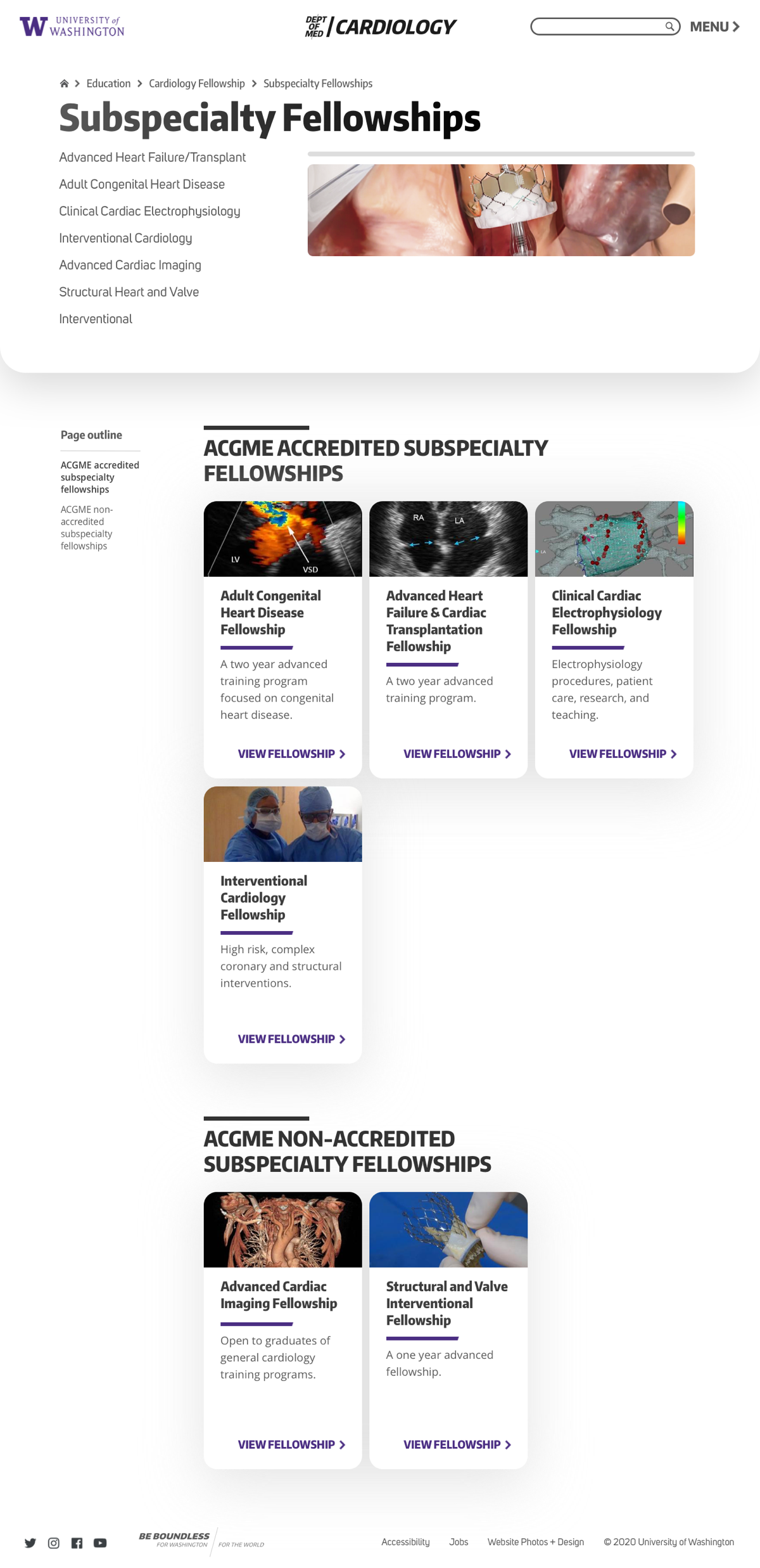
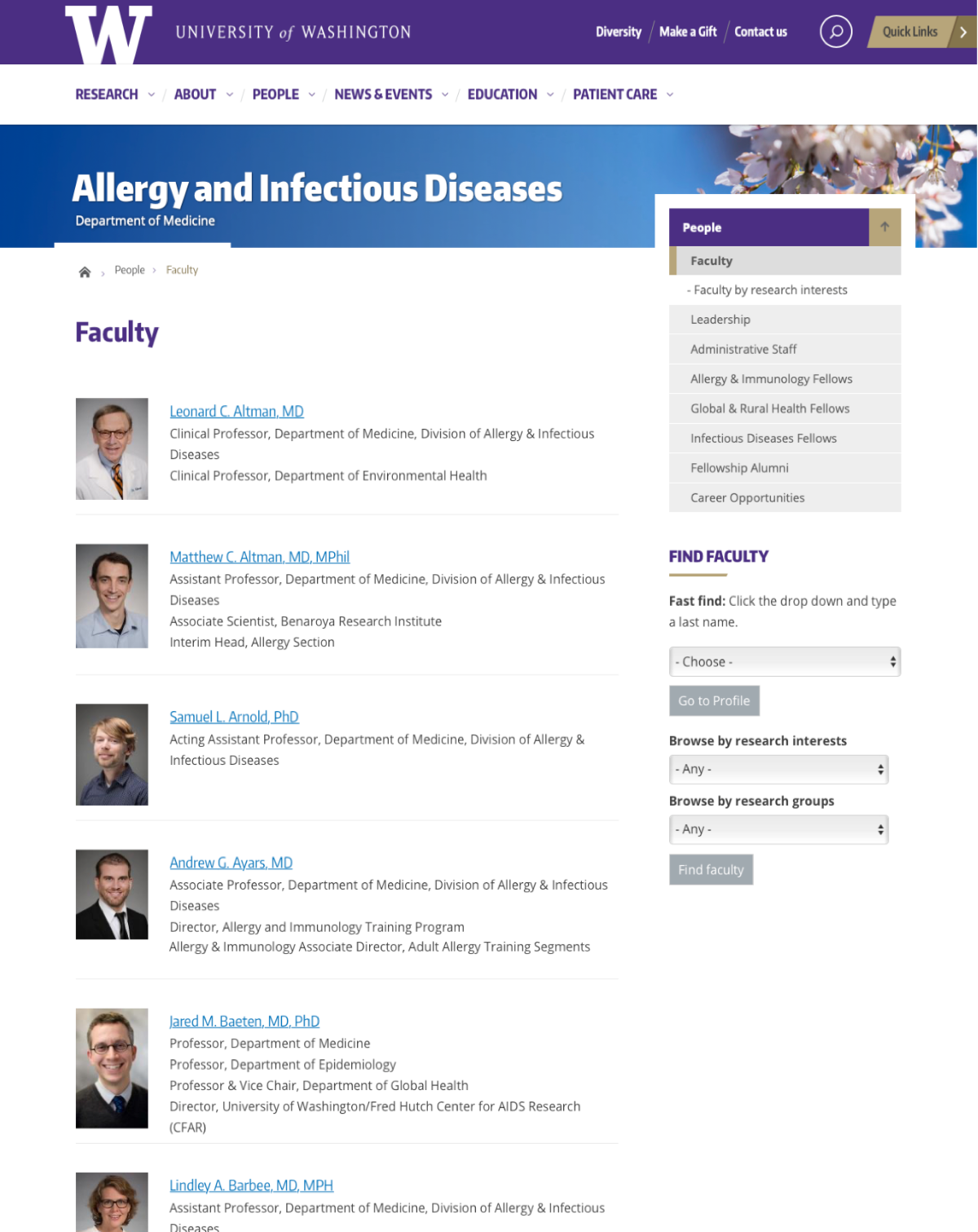
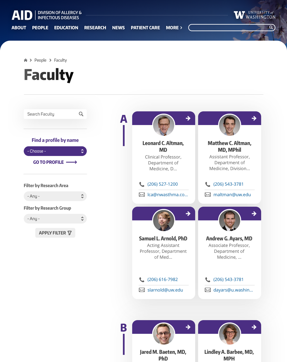
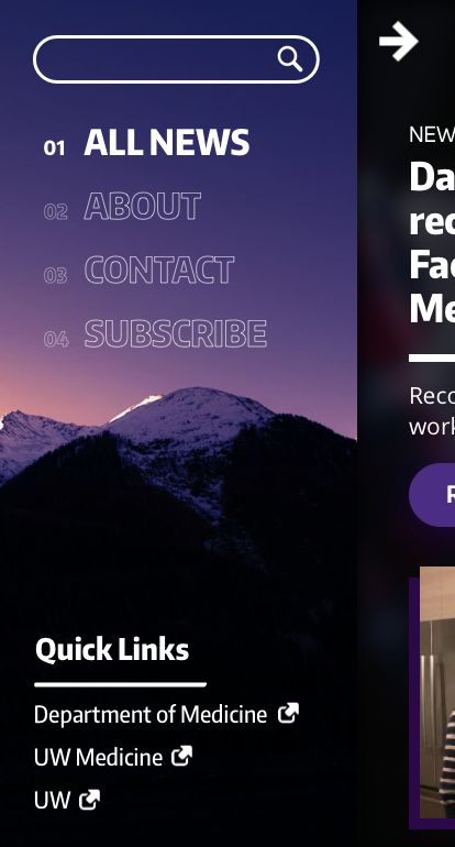
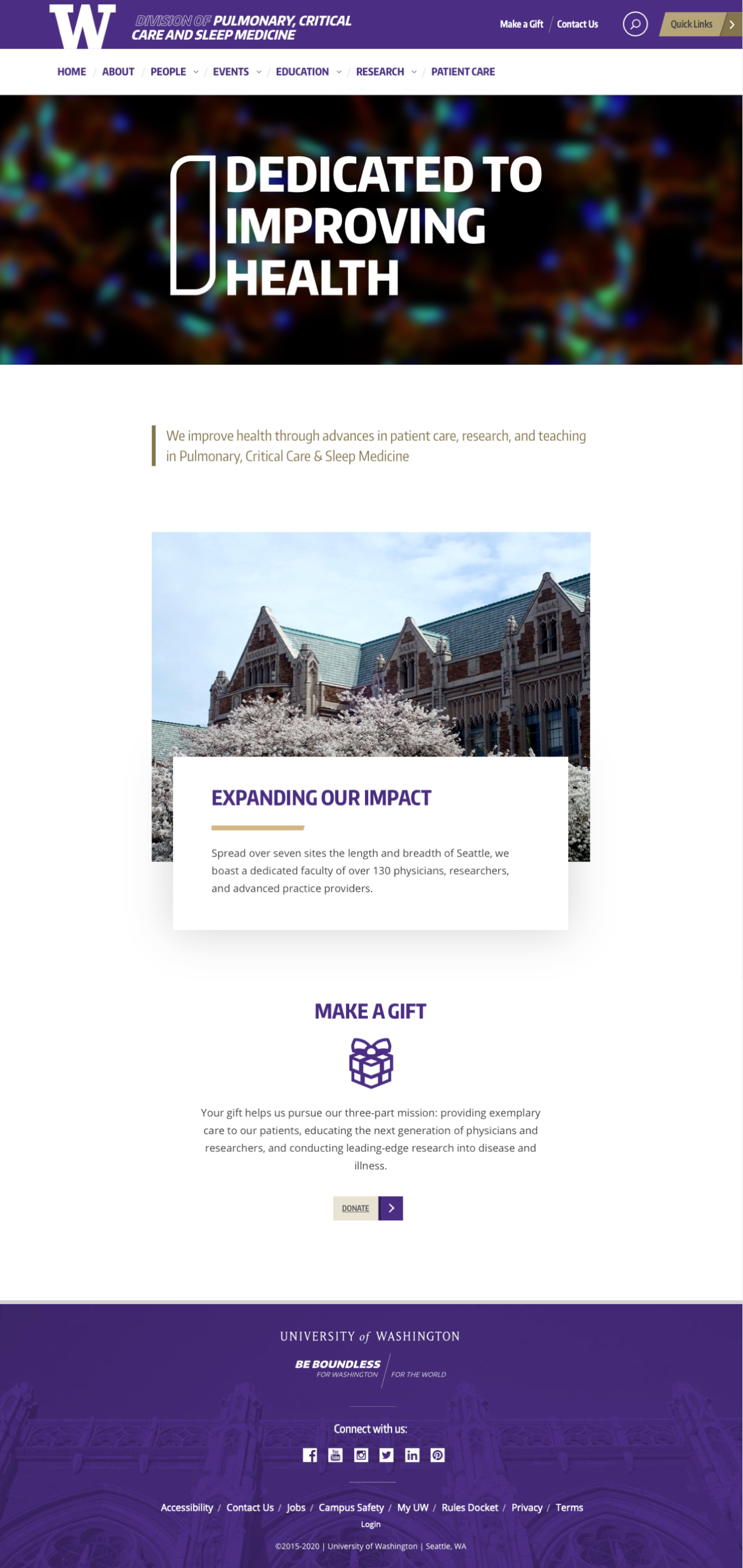
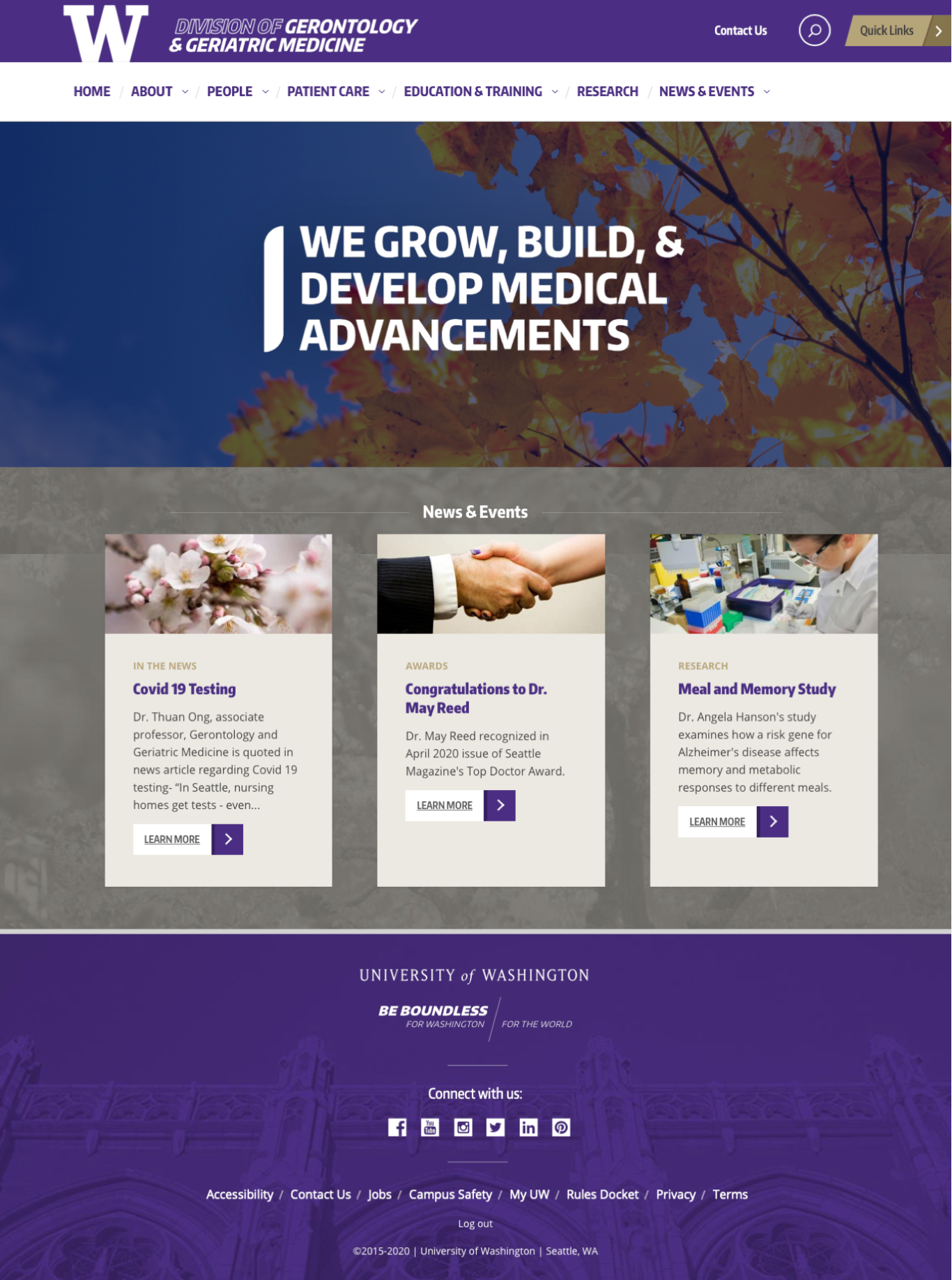
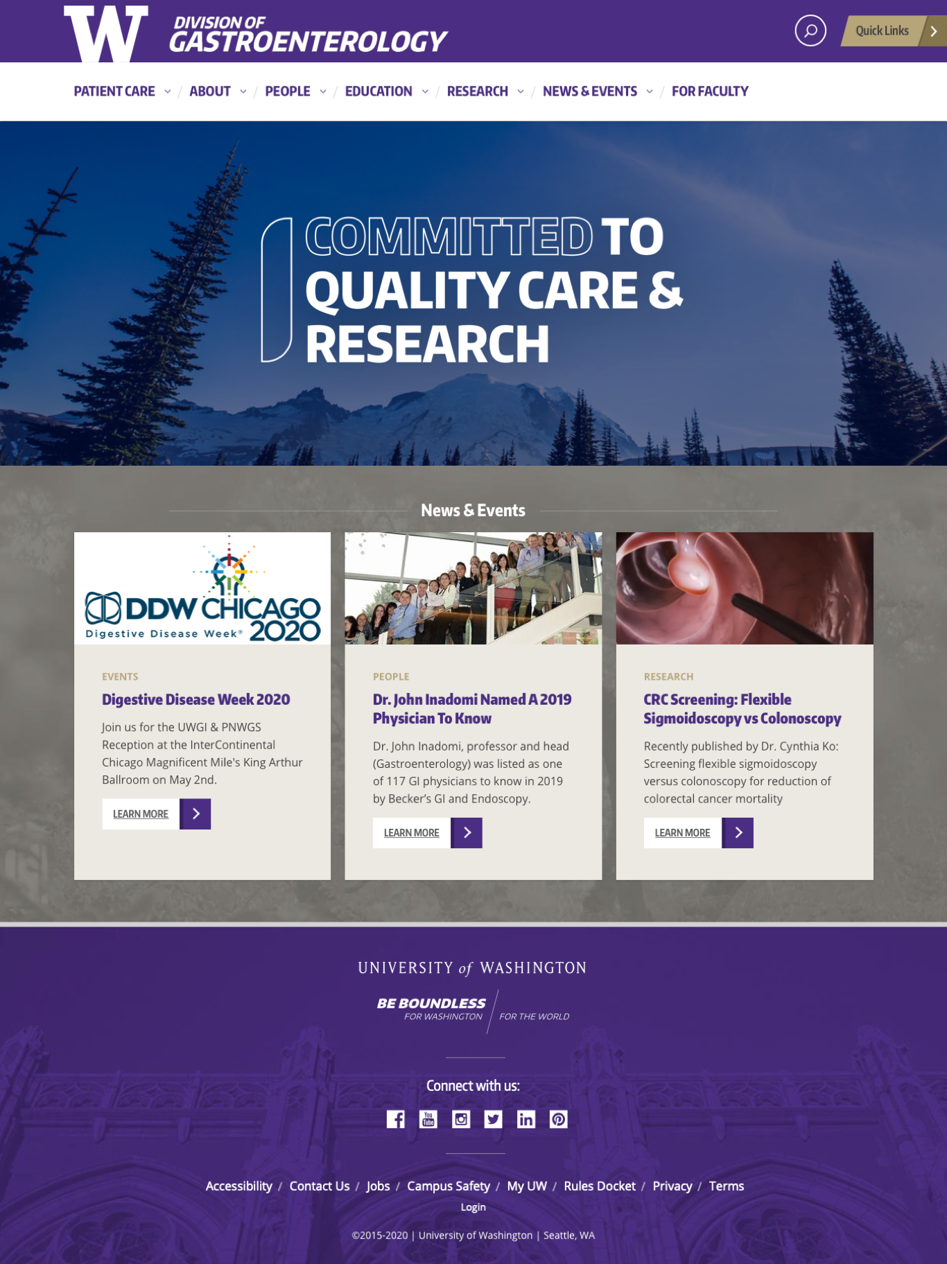
with the original templates, the department's identity felt like an afterthought, and its content was somewhat unorganized. utilizing rounded corners and a more 'card-centric' design, i was able to give a more unique look and feel to the department aesthetic, all the while organizing content in a more concise and digestible manner.
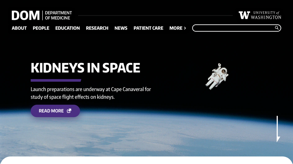
with the new templates, clients have the ability to choose between a tucked-away menu and a more traditional inline menu – both of which solve ux issues with the original dropdown menu
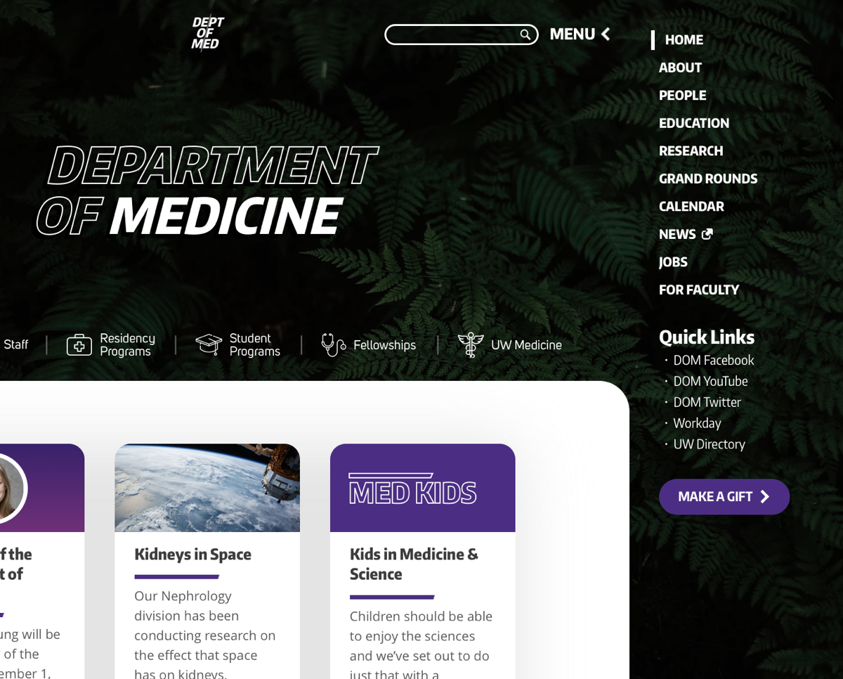
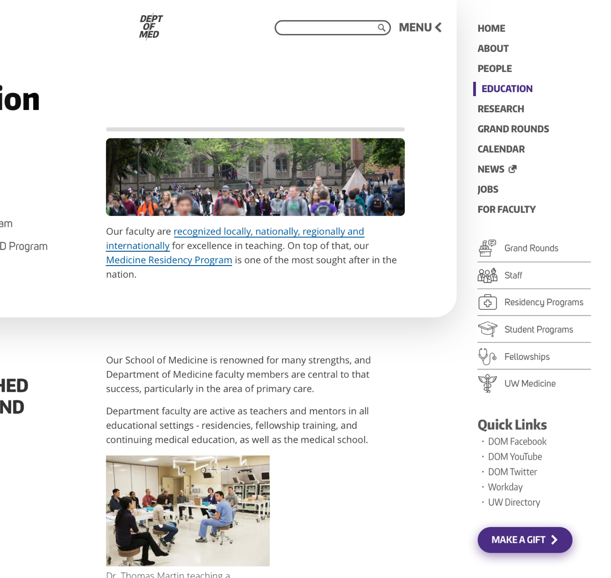
the original templates were not 'scan friendly.' because users scan websites for the information they're looking for, i designed a page outline section (located on the left, in a 'fixed' position) that allows readers to quickly jump to the information they're looking for.
in addition, with the absence of a sidebar and the clear visual separation of content above/below the fold, my design encourages editors to be more intentional with content placement and order.
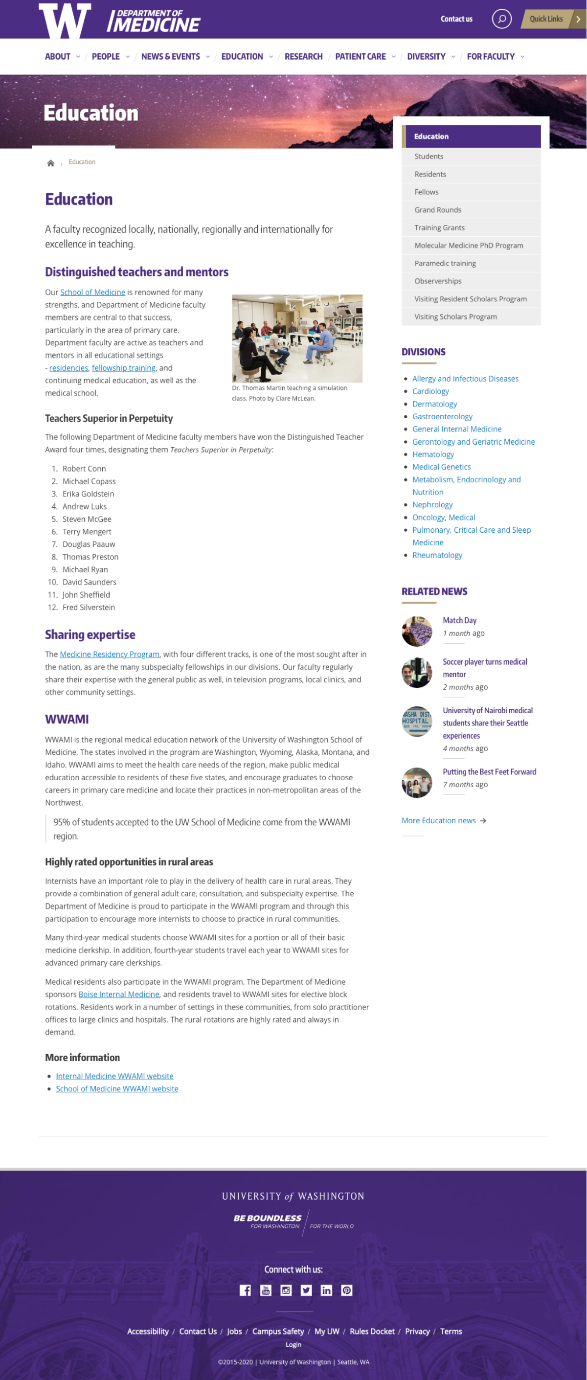
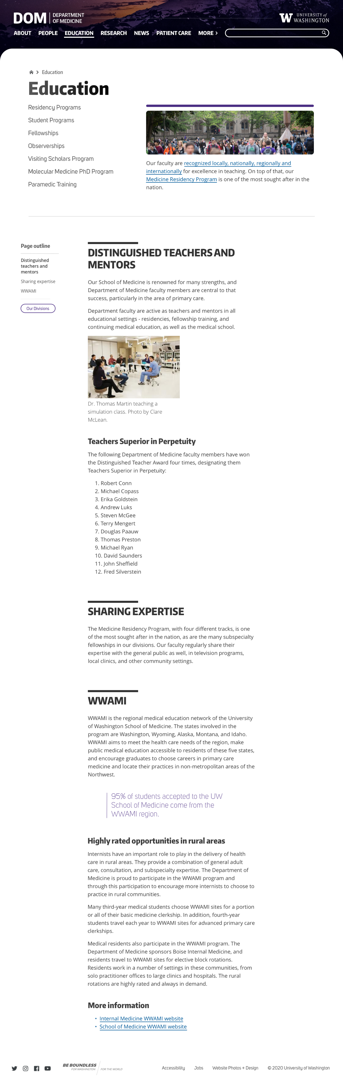
the above screenshots are only a tiny portion of the work done on this project. after many iterations and many design decisions, the finalized product completely transforms the web and mobile experience into something new, useful, and exciting.
this project was especially fun to work on, and hopefully marks a new chapter in the story of this incredible department.
as with every project, an in-depth walkthrough is available upon request.
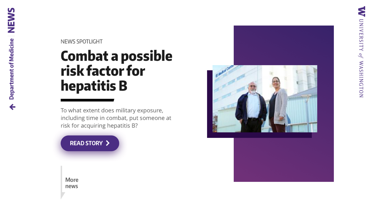
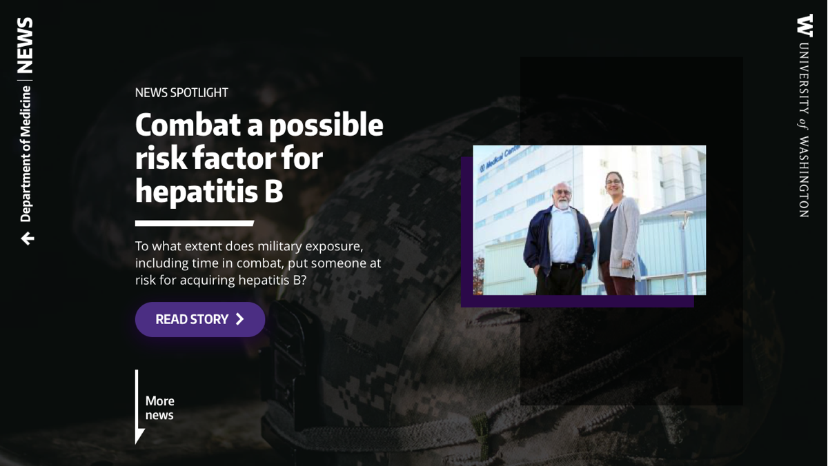
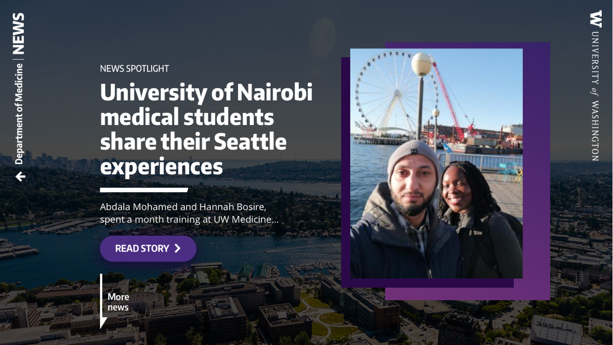
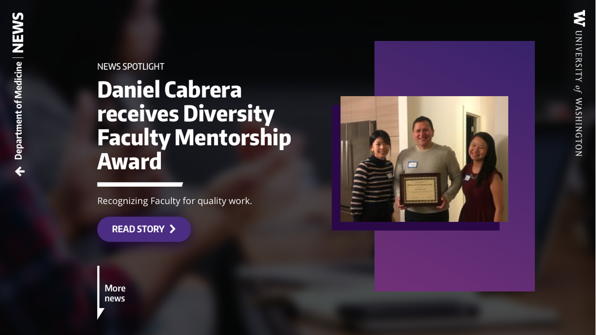
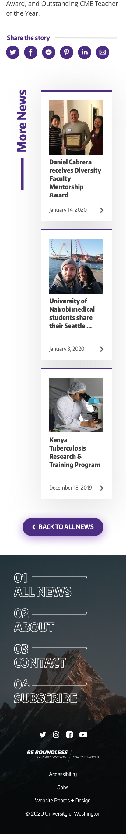
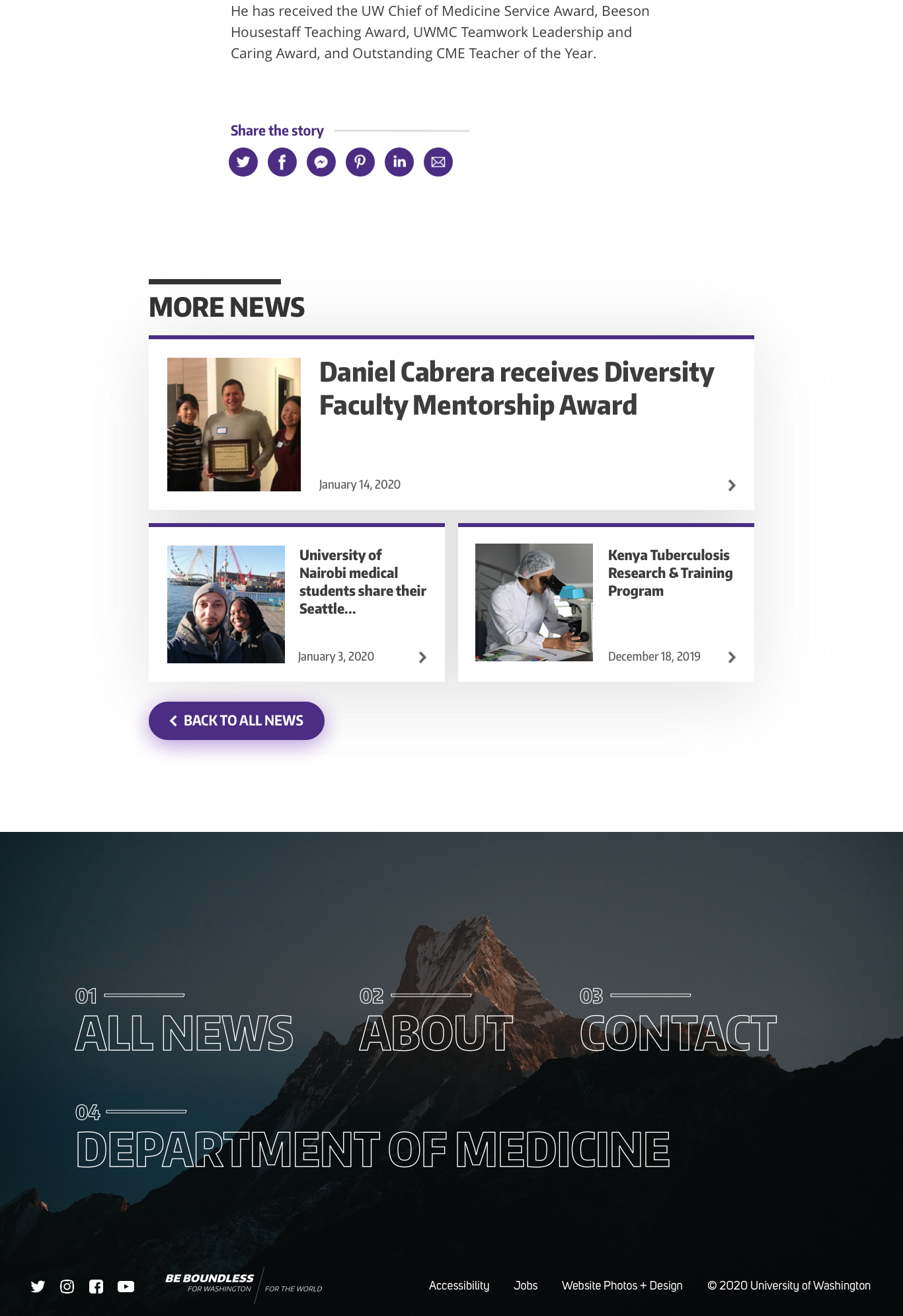
department news stories were scattered everywhere, with no single website to live on. i suggested a conglomerate news site for our department and its divisions, and leadership loved the idea.
design a news site that would act as the go-to for all things news – both for the department and for the public. the end result needed to:

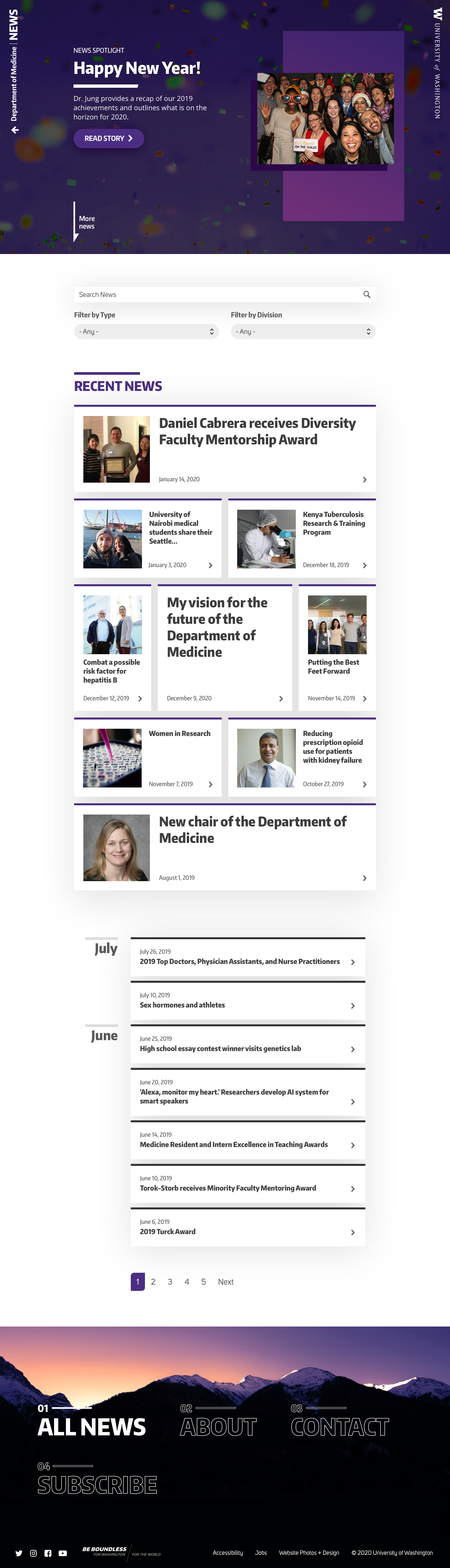
i moved forward with the above 'card' design because it worked well with the small images that would often accompany news stories (the department did not have access to a regular photographer).
in addition, it was important to create a similar aesthetic to that of the web framework redesign (case study #1) to give the department's brand identity a sense of thematic consistency.
i decided on a multi-option homepage layout to give news stories different 'tones.' as a result, a single story could be presented in a few different ways, depending on the tone the author wanted to convey.
with the focus of the news site being news, i kept the top of each page free from getting bogged down with links. in order to do so, i tucked the sparse navigation off and away to the side, with the focus being more on the content and vertical nature of the ui.
my design moves the eye in a vertical motion, much like what inspired it: newspapers and magazines.
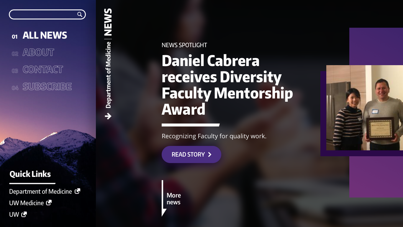
complete with bold headers (again, à la the web framework redesign introduced in case study #1), text callout options and background image overlays, each news item can highlight important story aspects to the reader.
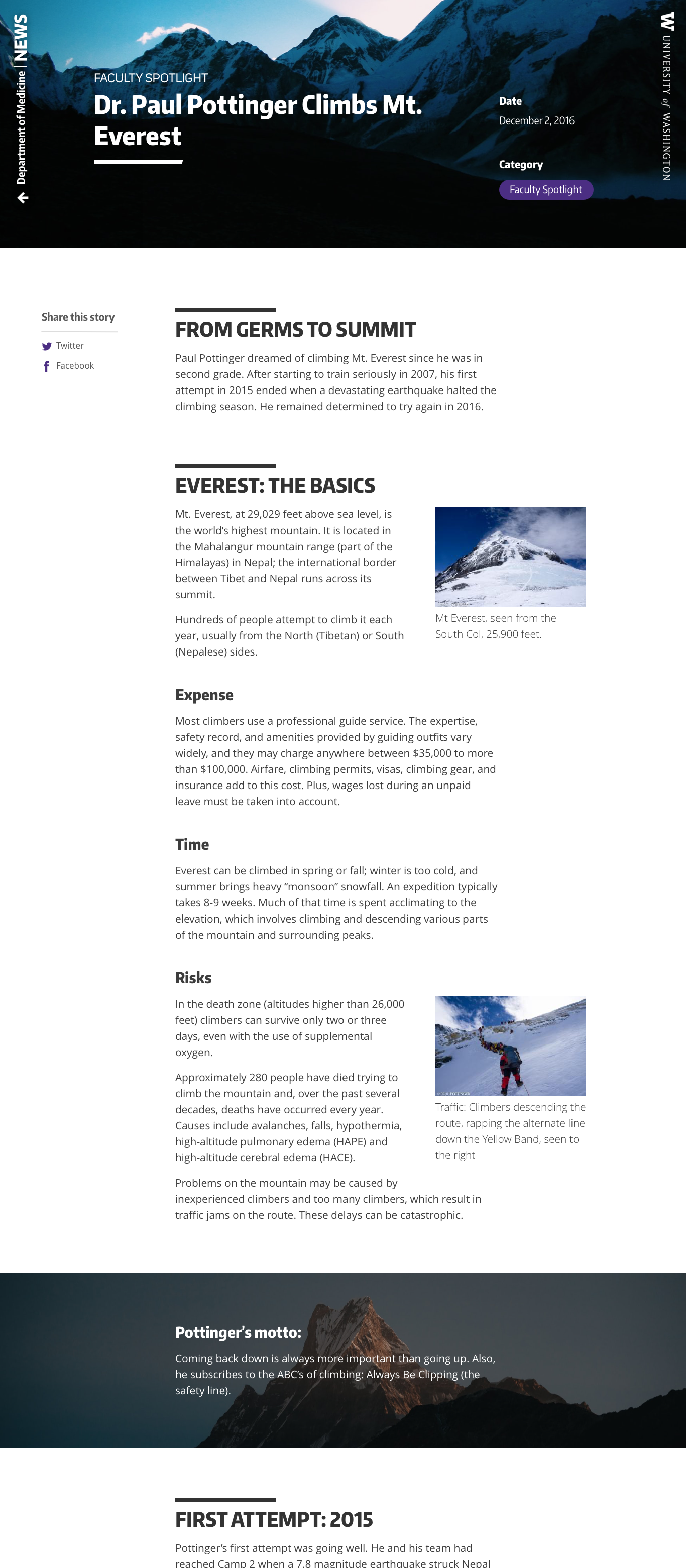
at the end of each story, readers get the opportunity to share said story or read related/recent stories.
while the desktop version has an everpresent 'share' option for facebook and twitter (our most active social medias), both the mobile and desktop designs give users the chance to share stories on a number of different platforms.
the process of designing a news site for the biggest department at the university came with many challenges.
from balancing design with functionality to designing for little/no media use-cases, this was an incredibly challenging (and rewarding) project.
as with every project, an in-depth walkthrough is available upon request.
the center for emerging & re-emerging infectious diseases (long names tend to be common in the medical field) was looking to create a new website after years of using a very stagnant website.
i had just started with the department of medicine, and the template options we offered at the time were incredibly limiting.
as the new designer/developer, i wanted to give the center team more than the two very simple template options that the framework had to offer.
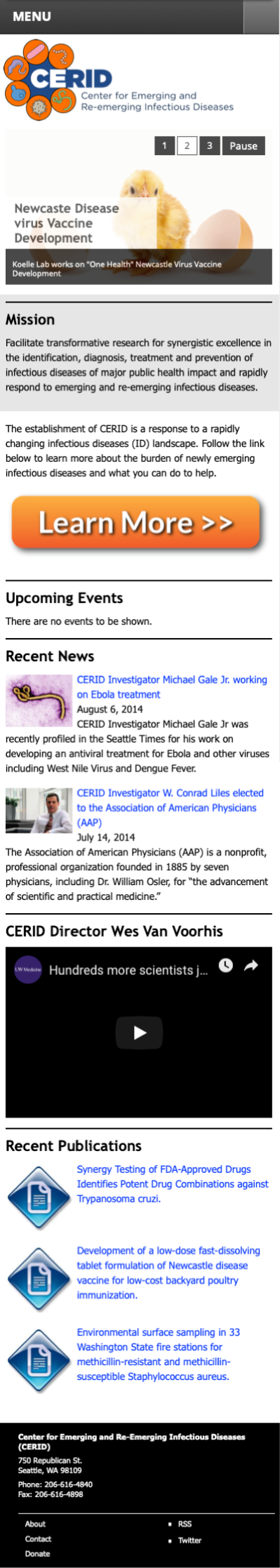
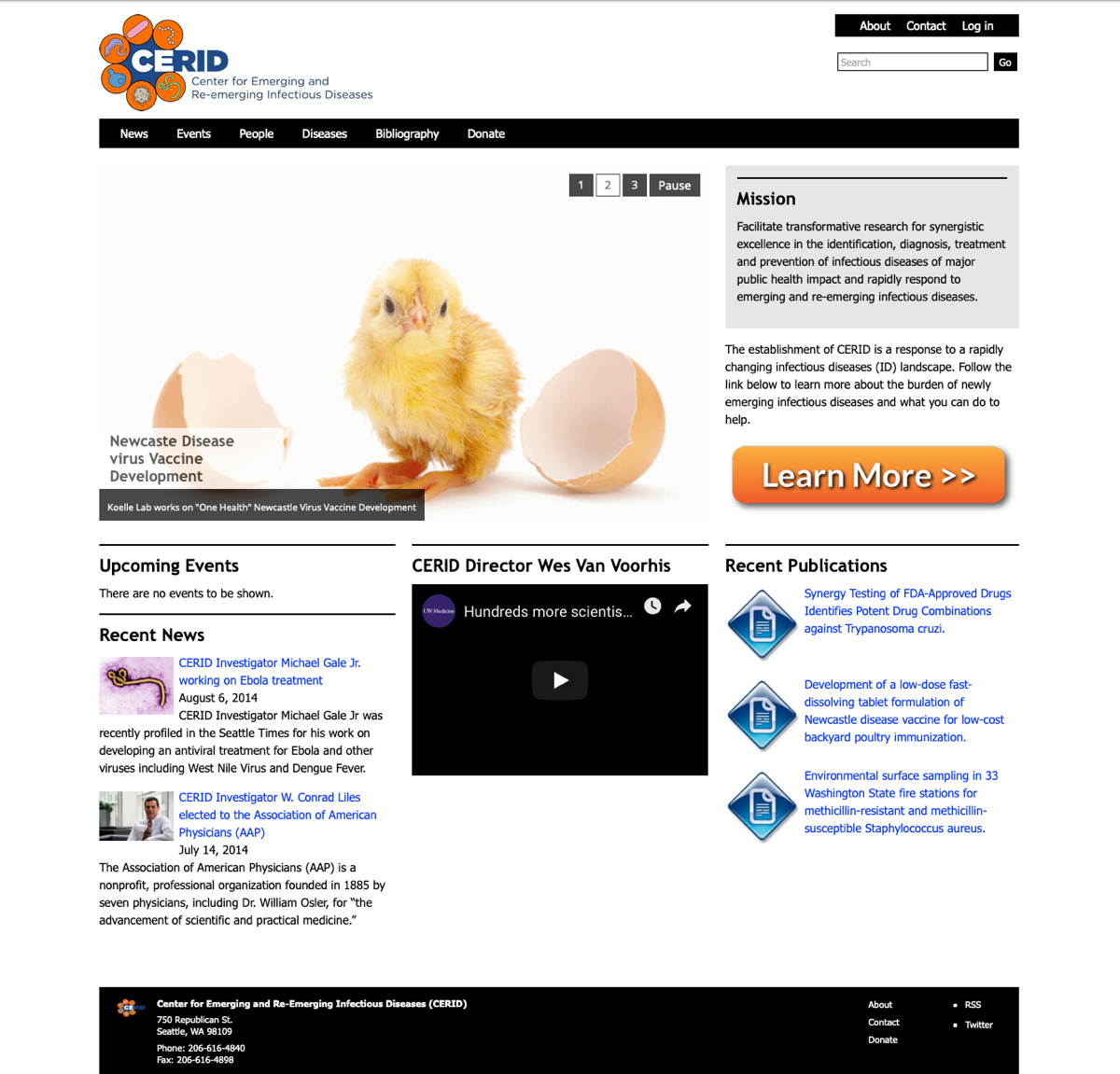
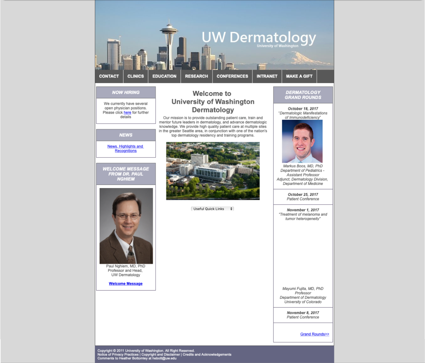
as shown in case study #1, the two original templates were the following:
the framework at this point was hosting around 14 websites with just 2 template options. as a result, every website looked incredibly similar to every other website.
the biggest issue with this was not that the template options were plain (although that didn't help), but that no one site looked different from another to confused users – they would often navigate to an entirely different website without realizing they had done so.
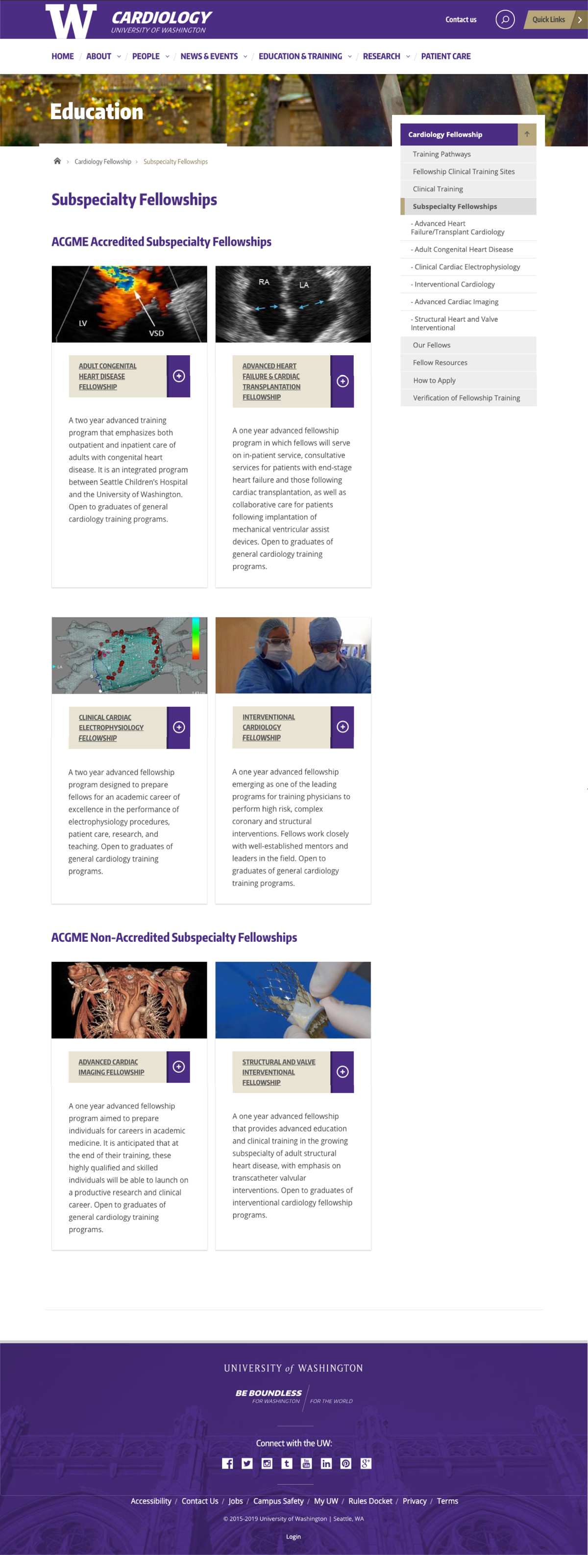
after toying around with different design ideas and user stories, i very quickly came up with a template design option that could be built in a month (our timeline was tight). the new template was:
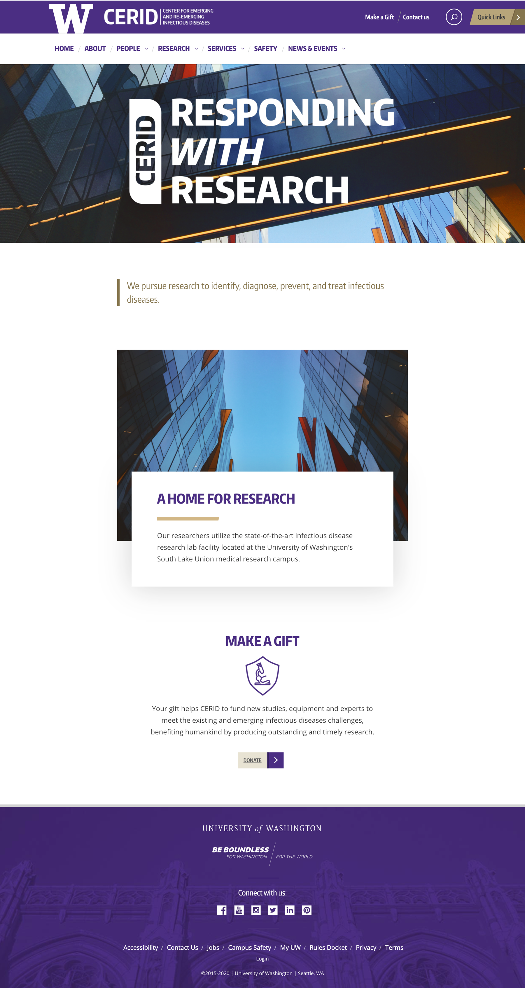
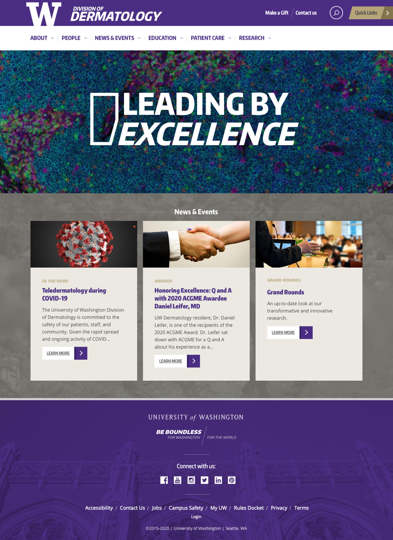
the cerid team was incredibly happy with their new website. it breathed new life into their web presence and brand awareness, which was exciting to see for such an important research center.
'template 3' was a hit, and as you can see with case study #4 (department of medicine division sites), we continued to use 'template 3' for the many division projects to come.
as with every project, an in-depth walkthrough is available upon request.
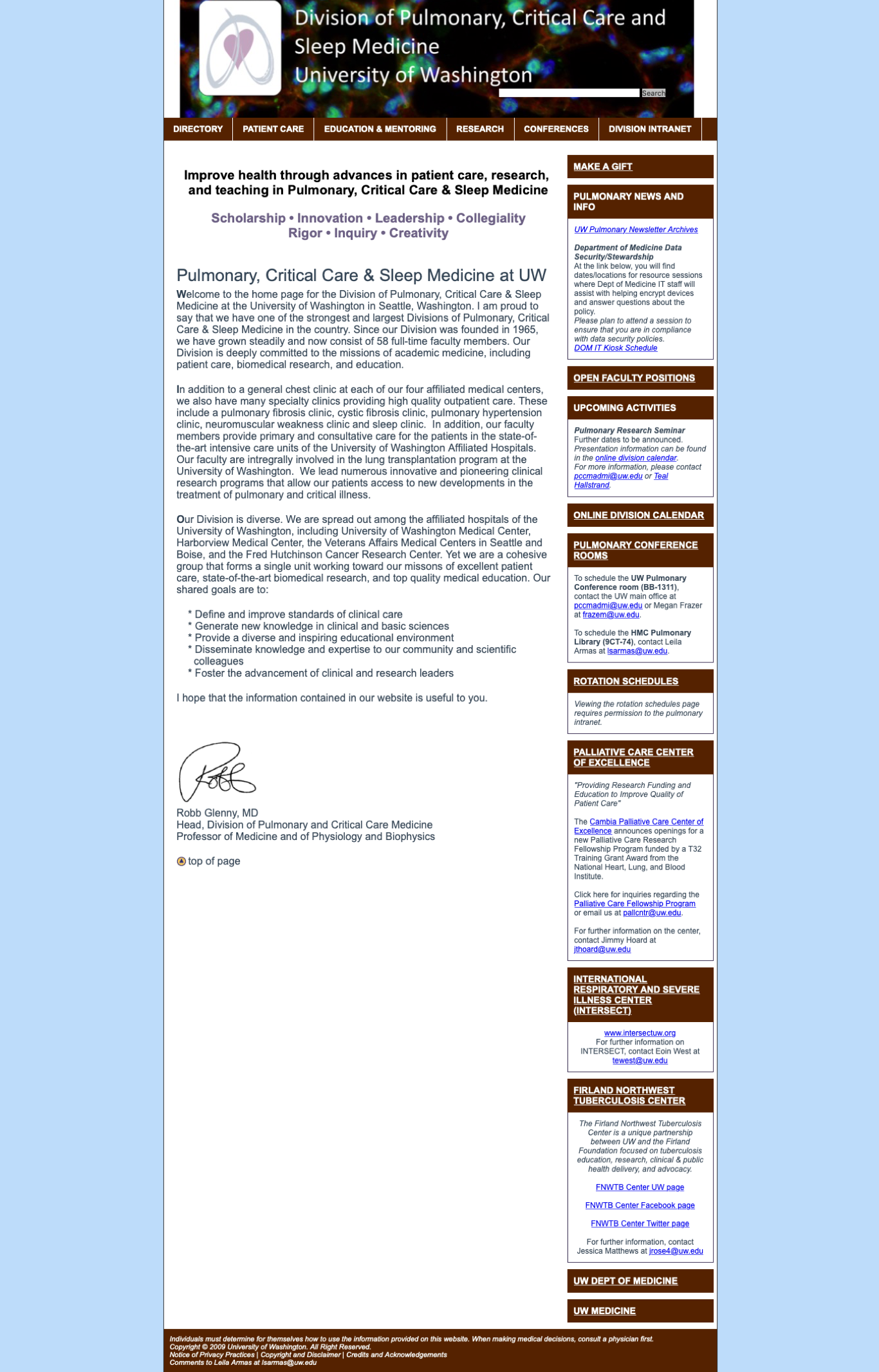
the department of medicine has 13 divisions, and about half of said divisions' websites were on the web framework when i started this position. the remaining websites not on the framework were incredibly outdated and difficult to use, often times resulting in a decrease in recruitment numbers.
since day 1, the goal was to bring on the remaining divisions so that the department of medicine could present a more unified and modern web presence to internal/external audiences.
in my first 6 months of employment, we added 3 division sites. we added 3 more over the course of the following year, pushing the total number to 12 division sites – all the while working on a number of other web projects.
below are a few before & after shots of our division sites. you can see that they all went with the 'template 3' option i created back in 2018 for cerid (case study #3).
like most improvement-related projects, this project will never truly be 'closed.' the department of medicine carries a rich history of innovation, and i've been lucky enough to see a small fraction of it through these division website projects.
in the same way that the divisions will improve over time, so too will their websites.
as with every project, an in-depth walkthrough is available upon request.
like many other departments at the university, obgyn was looking to update their website.
by this point we had designed and built a large number of division and center sites. word had started going around about our service, and once the department of obgyn caught wind, they reached out to us for help.
design and build a new site with obgyn leadership while migrating content over from their existing site. the finished site needed to:
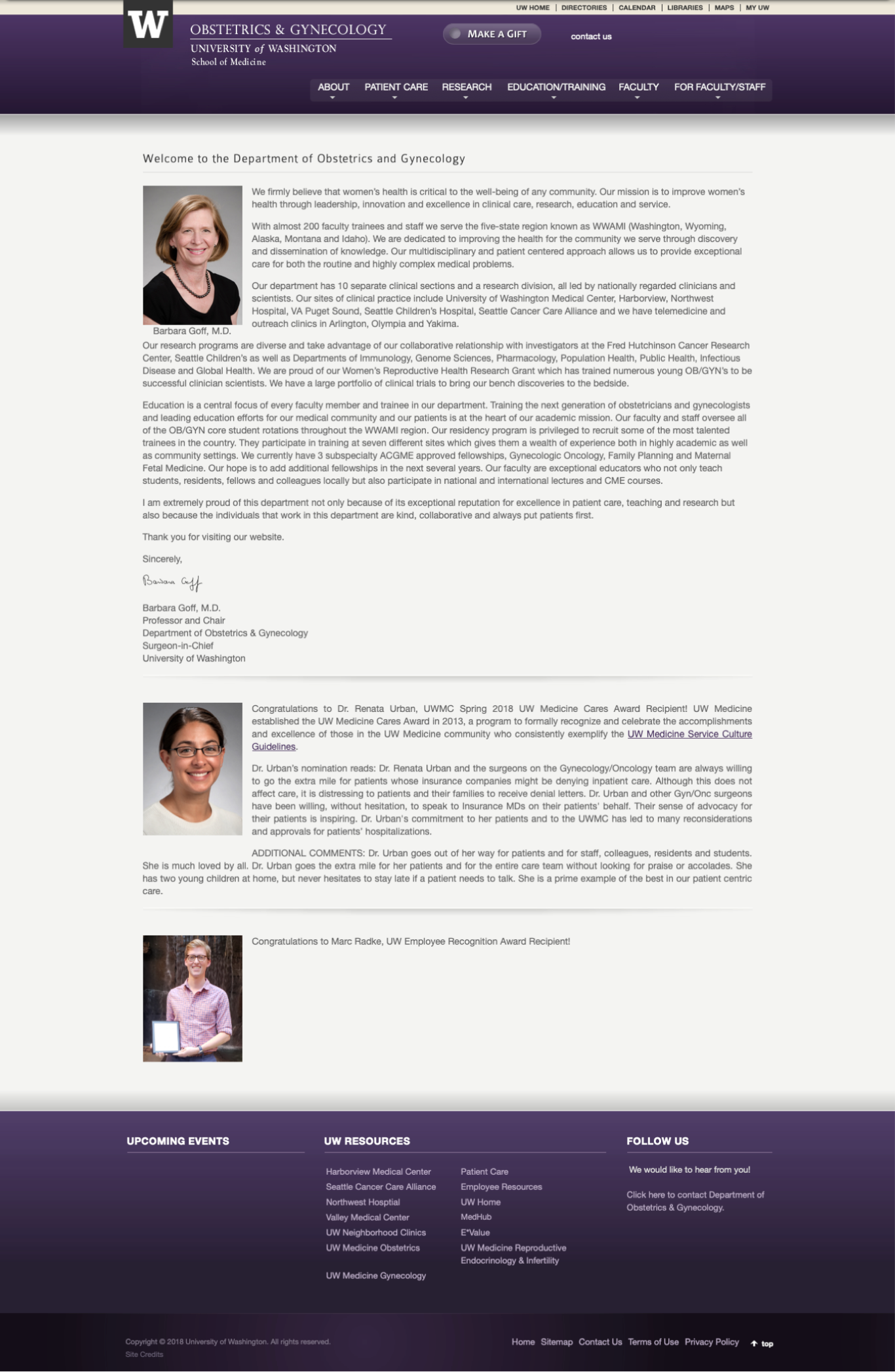
the original website was full of issues, including:
we had an option with our framework templates to turn on a 'hero news item' functionality. this allowed a news item to be highlighted on the homepage, and i worked with obgyn leadership to make sure they displayed their news stories as best they could with this feature.
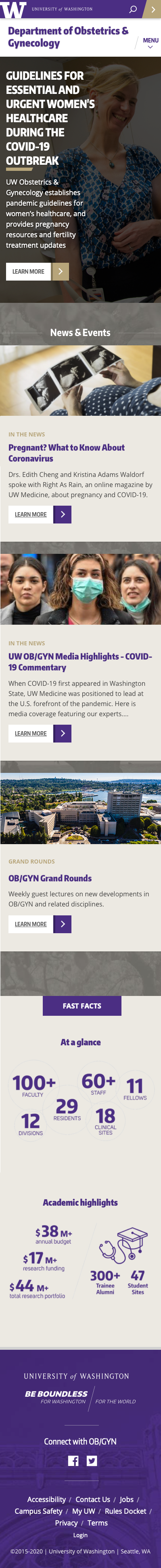
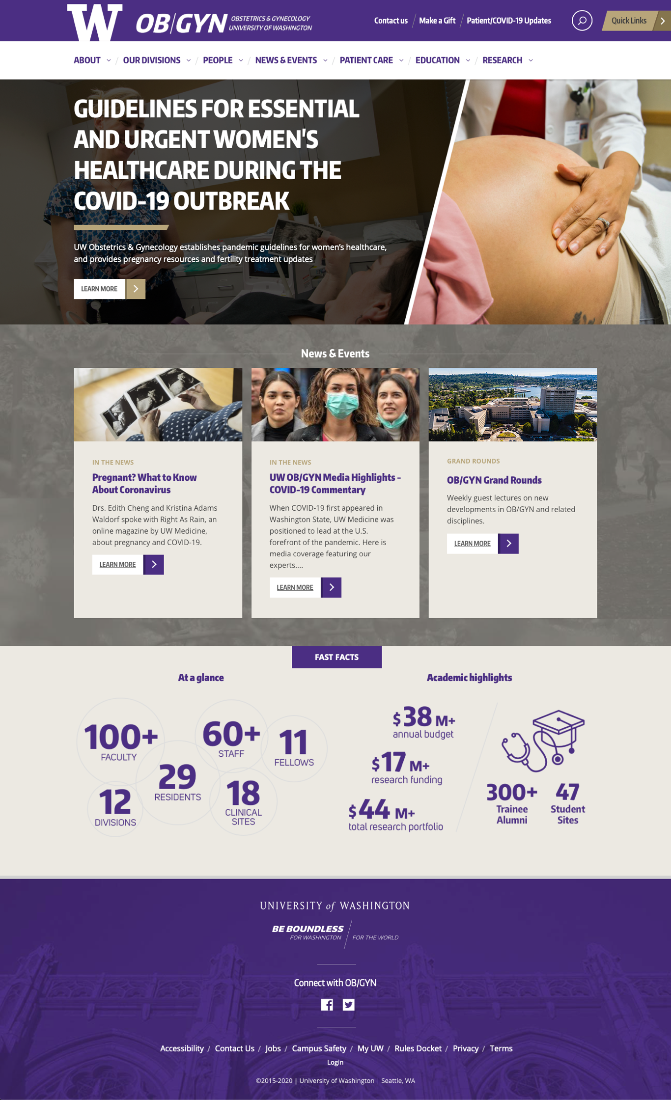
obgyn (like all other clients) were brought on to the framework prior to our drupal 8 update. while their current site is a fantastic improvement from the original, the plan is to eventually move them over to drupal 8 with my more current design (case study #1).
this was the first project where we brought in money for our department. prior to obgyn, we had no paying clients, but our hard work building and designing so many sites in such little time quite literally payed off.
obgyn was a joy to work with, and they were just as happy as we were with the finished product.
as with every project, an in-depth walkthrough is available upon request.